Prezado leitor,
Neste post irei apresentar como instalar o GeoServer 3 juntamente com o PostgreSQL 18/PostGIS utilizando Docker em um servidor executando Ubuntu Linux 26.04.
Ao final deste tutorial você terá um ambiente pronto para desenvolvimento, testes ou treinamentos, contendo:
- PostgreSQL 18 + PostGIS 3.6
- GeoServer 3.0.0
- Nginx como proxy reverso
- Estrutura organizada para persistência dos dados
- Instalação totalmente baseada em containers Docker
Pré-requisitos:
- Ubuntu 26.04
- Acesso sudo
- Conexão com Internet
- Pelo menos 4 GB RAM (8 GB recomendado)
Sem enrolação, vamos aos passos:
1. Atualizar o Ubuntu
Antes de instalar qualquer software é recomendável atualizar os repositórios e aplicar as últimas atualizações do sistema operacional.
> sudo add-apt-repository universe
> sudo apt update
> sudo apt upgrade -y
2. Instalar apenas os pacotes necessários
Nesta etapa serão instaladas apenas as ferramentas utilizadas durante a instalação do Docker e administração básica do servidor.
> sudo apt install -y \
    apt-transport-https \
    ca-certificates \
    curl \
    gnupg \
    lsb-release \
    software-properties-common \
    vim \
    unzip \
    wget \
    htop \
    net-tools \
    jq
3. Adicionar os repositórios do Docker
O Docker mantém seu próprio repositório oficial. Nesta etapa iremos adicionar sua chave GPG e registrar o repositório oficial no Ubuntu.
> sudo mkdir -p /etc/apt/keyrings

> curl -fsSL https://download.docker.com/linux/ubuntu/gpg \
| sudo gpg --dearmor -o /etc/apt/keyrings/docker.gpg

> sudo chmod a+r /etc/apt/keyrings/docker.gpg

> echo \
"deb [arch=$(dpkg --print-architecture) signed-by=/etc/apt/keyrings/docker.gpg] \
https://download.docker.com/linux/ubuntu \
$(lsb_release -cs) stable" \
| sudo tee /etc/apt/sources.list.d/docker.list > /dev/null
4. Instalar Docker
Agora instalaremos o Docker Engine, Docker Buildx e o Docker Compose Plugin.
> sudo apt update

> sudo apt install -y \
    docker-ce \
    docker-ce-cli \
    containerd.io \
    docker-buildx-plugin \
    docker-compose-plugin
5. Habilitar Docker
Habilite o serviço do Docker para que ele seja iniciado automaticamente sempre que o servidor for reiniciado.
> sudo systemctl enable docker
> sudo systemctl start docker
6. Ajustar timezone e sincronizar horário
Manter o timezone correto facilita a análise de logs e evita problemas de horário entre GeoServer, PostgreSQL e sistema operacional.
> sudo timedatectl set-timezone America/Sao_Paulo
> timedatectl
7. Estrutura
A estrutura abaixo será utilizada para organizar os arquivos do projeto e facilitar futuras manutenções.
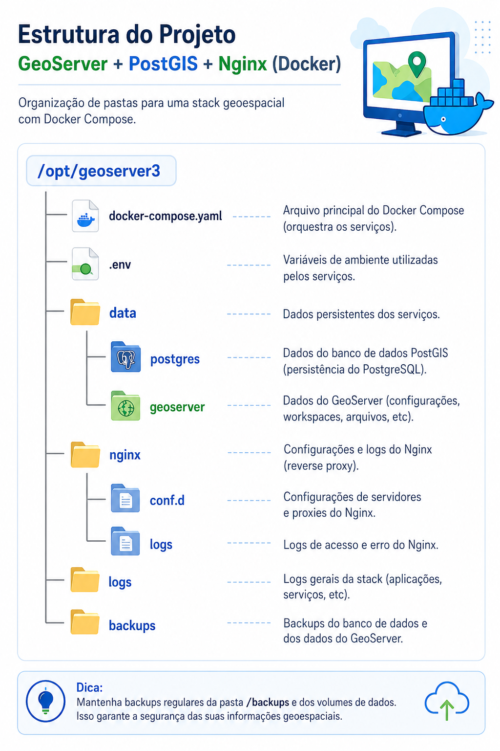
8. Criar a Estrutura
> mkdir -p /opt/geoserver3
> cd /opt/geoserver3

> mkdir -p data/postgres
> mkdir -p data/geoserver
> mkdir -p nginx/conf.d
> mkdir -p nginx/logs
> mkdir -p logs
> mkdir -p backups
9. Criar o arquivo docker-compose.yaml
O arquivo docker-compose.yaml descreve toda a infraestrutura da aplicação e será responsável por criar automaticamente os containers do PostgreSQL/PostGIS, GeoServer e Nginx.
nano docker-compose.yaml
Copie todo o conteúdo abaixo para o arquivo.
services:

  postgis:
    image: postgis/postgis:18-3.6
    container_name: postgis

    restart: unless-stopped

    environment:
      POSTGRES_DB: ${POSTGRES_DB}
      POSTGRES_USER: ${POSTGRES_USER}
      POSTGRES_PASSWORD: ${POSTGRES_PASSWORD}
      TZ: ${TZ}

    # Descomente as linhas abaixo apenas se desejar permitir acesso externo ao PostgreSQL.
    #ports:
    #  - "5432:5432"

    volumes:
      - ./data/postgres:/var/lib/postgresql

    healthcheck:
      test:
        [
          "CMD-SHELL",
          "pg_isready -U ${POSTGRES_USER} -d ${POSTGRES_DB} -h localhost"
        ]
      interval: 10s
      timeout: 5s
      retries: 10
      start_period: 20s

    networks:
      - geoserver-network


  geoserver:
    image: docker.osgeo.org/geoserver:3.0.0
    container_name: geoserver

    restart: unless-stopped

    depends_on:
      postgis:
        condition: service_healthy

    ports:
      - "8080"

    environment:
      TZ: ${TZ}

      PROXY_BASE_URL: ${PUBLIC_GEOSERVER_URL}

      INSTALL_EXTENSIONS: "true"

      STABLE_EXTENSIONS: "excel,importer,image,web-resource,wps"

      EXTRA_JAVA_OPTS: >-
        -Xms2G
        -Xmx4G
        -Duser.timezone=${TZ}
        -Dfile.encoding=UTF-8
        -Djava.awt.headless=true

      CORS_ENABLED: "true"
      CORS_ALLOWED_ORIGINS: "*"
      CORS_ALLOWED_METHODS: "GET,POST,PUT,DELETE,HEAD,OPTIONS"
      CORS_ALLOWED_HEADERS: "Origin,Accept,X-Requested-With,Content-Type,Access-Control-Request-Method,Access-Control-Request-Headers,Authorization"
      CORS_ALLOW_CREDENTIALS: "false"

      ROOT_WEBAPP_REDIRECT: "true"

    volumes:
      - ./data/geoserver:/opt/geoserver_data

    healthcheck:
      test:
        [
          "CMD-SHELL",
          "curl --fail http://localhost:8080/geoserver/web/ || exit 1"
        ]
      interval: 30s
      timeout: 15s
      retries: 10
      start_period: 180s

    networks:
      - geoserver-network

  nginx:
    image: nginx:alpine
    container_name: nginx
    restart: unless-stopped

    depends_on:
      geoserver:
        condition: service_healthy

    ports:
      - "80:80"
      # Descomente a linha abaixo após configurar HTTPS no Nginx.
      #- "443:443"

    volumes:
      - ./nginx/conf.d:/etc/nginx/conf.d:ro
      - ./nginx/logs:/var/log/nginx

    networks:
      - geoserver-network

networks:
  geoserver-network:
    driver: bridge
Observação: Um dos benefícios da imagem oficial do GeoServer é a possibilidade de instalar automaticamente as extensões durante a inicialização do container. Neste tutorial já deixamos configurados alguns dos plugins mais utilizados em projetos reais: Excel (exportação de dados), Importer (importação de arquivos), Image (suporte a imagens), Web Resource (recursos web) e WPS (Web Processing Service). Dessa forma, ao término da instalação, o ambiente já estará pronto para utilização, sem necessidade de instalar essas extensões manualmente.
Observação: Os nomes informados na variável STABLE_EXTENSIONS correspondem aos identificadores oficiais das extensões utilizadas pela imagem Docker do GeoServer. A lista completa de plugins disponíveis e seus respectivos nomes pode ser consultada na documentação oficial do Docker do GeoServer: Docker Container – Adding GeoServer Extensions. Para conhecer a finalidade de cada extensão, consulte também a documentação oficial de extensões do GeoServer: GeoServer Extensions Documentation.
E não esqueça de criar também o arquivo .env:
> nano .env
E inserir o seguinte conteúdo:
POSTGRES_DB=geoserver
POSTGRES_USER=geoserver
POSTGRES_PASSWORD=SUBSTITUA_POR_UMA_SENHA_FORTE

PUBLIC_GEOSERVER_URL=http://SEU_IP/geoserver

TZ=America/Sao_Paulo
Substitua SUBSTITUA_POR_UMA_SENHA_FORTE por uma senha segura e SEU_IP pelo endereço IP público do servidor antes de iniciar os containers.
A variável PUBLIC_GEOSERVER_URL deve apontar para o endereço utilizado pelos usuários para acessar o GeoServer. Durante os testes ela pode utilizar o IP do servidor. Em ambientes de produção recomenda-se utilizar um domínio com HTTPS.
Dica: Nunca publique este arquivo em repositórios Git públicos, pois ele contém a senha do banco de dados.
10. Criar o arquivo geoserver.conf
O Nginx será utilizado como proxy reverso, permitindo acessar o GeoServer através da porta 80 e facilitando futuras configurações de HTTPS.
> nano nginx/conf.d/geoserver.conf
E insira o seguinte conteúdo:
server {
    listen 80;
    server_name _;

    client_max_body_size 2G;

    location = / {
        return 302 /geoserver/web/;
    }

    location /geoserver/ {
        proxy_pass http://geoserver:8080/geoserver/;

        proxy_set_header Host $http_host;
        proxy_set_header X-Real-IP $remote_addr;
        proxy_set_header X-Forwarded-Host $http_host;
        proxy_set_header X-Forwarded-Port $server_port;
        proxy_set_header X-Forwarded-Proto $scheme;
        proxy_set_header X-Forwarded-For $proxy_add_x_forwarded_for;

        proxy_connect_timeout 60s;
        proxy_send_timeout 600s;
        proxy_read_timeout 600s;

        proxy_request_buffering off;
        proxy_buffering off;
    }
}
11. Subir os containers
> docker compose up -d
Depois acesse no seu navegador http://SEU_IP/geoserver
12. Conclusão
Agora você possui um ambiente moderno baseado em containers, executando o GeoServer 3, PostgreSQL 18/PostGIS 3.6 e Nginx.
Essa estrutura pode ser utilizada para estudos, treinamentos, desenvolvimento e também servir como base para ambientes de produção de pequeno e médio porte.


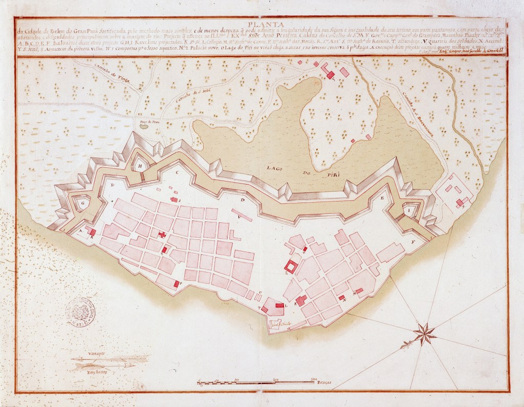 Historic map of Belém. Source:
  Photo by Michael Szell. Source:
 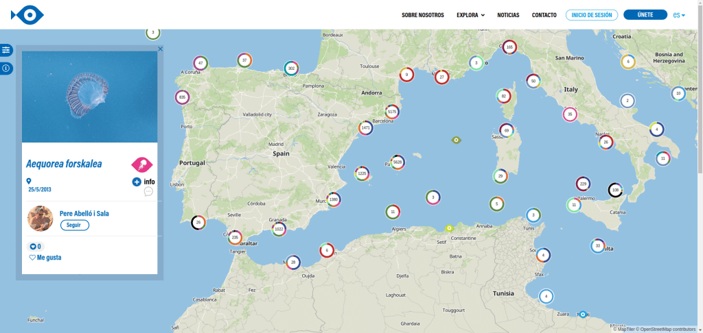 Imagen de la plataforma ciudadana Observadores del Mar
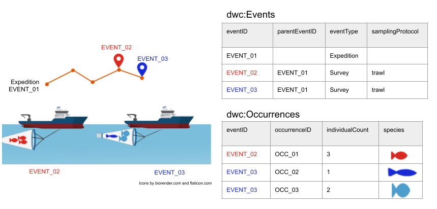 Event/occurrence model (Fuente: Biodiversity Information Standards (TDWG), licensed under a


.jpg&oldid=1181181948)