Lutra Consulting wraps up FOSSGIS 2026 in Göttingen. Discover the top trends: QGIS user expertise, self-hosting Mergin Maps, PostGIS integration, and vendor lock-in concerns.


You must be logged into the site to view this content.

So after finally getting MapGuide Open Source 4.0 out the door, I took a self-imposed hiatus from all things mapping/GIS related for several months, permanently moved from Windows to Linux as my daily driver OS just in time before the end of Windows 10 support, and also to mentally recharge and savor the relief of having this major burden (of releasing MGOS 4.0) being finally lifted off of my back.
I now return with a renewed vigor and some rough roadmaps for things going forward in MapGuide and my other various projects. Part of that renewed vigor is due to the advent of ...
by Jackie Ng (noreply@blogger.com) at April 08, 2026 03:11 PM

David Bann and Liam Wright have put together a great guide to Generative AI Tools for Quantitative Research on the NCRM resources site. This is a great overview of what Generative AI is, how it works and all of the potential different models available, both commercial and open source, as well as how to run some models locally rather than relying on the cloud.
They are also very focused on the practical elements of how to actually use the tools in your work, discussing the different approaches as well as highlighting the importance of making sure you do not share sensitive data with cloud services.
They also have a great selection of videos for setting up both cloud based and local LLMs for working with Stata and R scripts in a number of tools including VS Code:
Video 4 in their series had a thumbnail of a map, so of course that got me interested! Anyone reading this blog should know that I am a big fan of maps :-)
This was a great example of using Positron IDE (produced by the same people who make RStudio) to help write code that creates a map of crime rates across England and Wales. They give a great overview of the process of making this map, and say:
It really shows the potential this technology has about making a wide range of tools much more widely available and used.
However, it also shows some of the limitations of working with a generative AI. It is missing some key subject specific knowledge, with which you could turn this reasonable map to an excellent map without a lot more work.
I would recommend watching the video for more details, but I will summarise the key bits here (thanks Claude.ai for the summary, which I tweaked!)
So - very good as a first effort.
Just to be clear I am not trying to be critical of Liam or the resources he has created - these are amazing and it is great that they are out there. I am trying to highlight some of the limitations of relying exclusively on GenAI for working in an area new to you. In fact, Liam explicitly acknowledges this and has, in fact, signed up to one of my upcoming courses on to learn more about GIS :-)
So, what do I think Claude missed?
tmap package rather than the ggplot2 package for creating maps in R. ggplot2 is a generic graphics package - it can do maps, but can do other graphics as well. tmap is a specific mapping package, and the defaults for the maps it creates are better than the defaults ggplot2 uses - in my opinion. A lot of preference is down to individual style - there is no categorical right or wrong here. David O’Sullivan wrote a very nice comparison of the differences on his blog.So overall, generative AI is a fantastic tool and thanks to much to David and Liam for putting together this resource, and thanks to the NCRM for hosting it. It’s a great starting point for any new method, but has some clear limitations. If you know the field, then you already know what the limitations are, but if you are new to the field beware - generative AI will not tell you that it does not know things or what it might be missing. It’s well known for being over confident, so remember to bring your critical thinking when making use of these technologies!
If you want to learn more about GIS, and using R as a GIS, check out my up coming training courses with NCRM in April and May this year. If you have any questions, please do contact me.

In week 12, I started to get things back on track after being sick. I ran five days, biked one day, and took Saturday off to take my family to a Nuggets game in Denver.
12 hours, 9 minutes all training
34.8 miles running
5,800 ft D+ running (and treadmill)
My energy level was low to mid until Friday, when I rallied for a good interval workout on a 12% incline treadmill indoors and a sauna session after. My fitness didn't advance much in week ten, but I didn't lose a step. According to the machine, I went "up" beyond any of the Quad Rock climbs, and at a pace that I'd love to hit on race day.
Saturday, as I mentioned previously, I sat on my butt in a car and in Ball Arena, with Ruthie and our kids, and then we all met my folks in Denver for an early dinner. It was a wonderfully easy and sociable day. Some days I think we should be living in Denver instead of Fort Collins, and this was one of those days.
Sunday I went out for three hours on the rolling and punchy dirt trails east of Horsetooth Reservoir, intending to get 90 minutes of Z2-Z3 running. It was a great run. My legs felt lively during miles 2-12, and I pushed my gas pedal with enthusiasm. If I'd brought another two gels, I could have avoided bottoming out at mile 14. I'm hoping to feel that good and pain free at Quad Rock.

A dry, yellow-brown landscape under a blue and partly cloudy sky.


Listening to the news about the impact of the current war and the closure of the Strait of Hormuz, I was prompted to think about critical minerals that could also have massive disruptive impact in geopolitical turmoil.
I asked Claude “Can you build a dataset of the most critical minerals, where they are mined (mine sites or countries), shares of world production, price changes over 5-10 years, main usages so that we can build a map of these commodities. Build it in a way that we can extend if we find more data” and it found me some data using these sources:
I then asked for a map “let’s build a map using my standard map app settings that you should have stored in memory. Users should be able to see the map symbols showing percentages of world production for each mineral. a selector to choose an individual mineral or an overall view. an option to show mineral supply by usage. Notes to appear on minerals and use cases (popups or side panels)” and after a few iterations and some data cleanup I ended up with the map at the top of this post. Not perfect but good enough to explore the data and to understand which minerals are used in key aspects of modern life and which countries may have a stranglehold on those minerals.
I am learning how to navigate and better prompt Claude, it has stored some of my favourite settings so there is some consistency in what it generates. The whole process is getting faster. One thing I am beginning to realise is that when you use an AI to do your research and extract or build your data you really need some domain knowledge to do a sanity check otherwise you may be just mapping hallucinations.

Cloud masking is one of those steps you cannot really avoid when working with satellite data. Yet, it is often more cumbersome than it needs to be: different sensors come with different workflows, tools, and preprocessing requirements.
That is why I like OmniCloudMask. It is a Python library for cloud and cloud shadow detection in high to moderate resolution satellite imagery. Instead of relying on sensor-specific approaches, it uses a single model that generalizes across platforms.
According to the documentation, it supports resolutions from 10 m to 50 m and works with imagery from Sentinel-2, Landsat, PlanetScope, Maxar, and other sensors with Red, Green, and NIR bands. In practice, however, it also performs well on higher-resolution data, such as the 1.2 m Pléiades NEO imagery used in this example.
To illustrate how OmniCloudMask works in practice, I use a scene acquired on 25-04-2025 covering an area just south of Rotterdam. The data comes from the satellietdataportaal.
Using OmniCloudMask is straightforward. After installing the required modules (see the documentation), you only need to define the input scene and specify the band order:
from functools import partial
from pathlib import Path
from omnicloudmask import predict_from_load_func, load_multiband

wd = Path("/path/to/scene")
scene_paths = [wd / "scene.tif"]

# Band order: [Red, Green, NIR]
loader = partial(load_multiband, band_order=[1, 2, 4])

pred_paths = predict_from_load_func(scene_paths, loader)
The model then produces a categorical cloud mask with four classes: clear, thick cloud, thin cloud, and cloud shadow. The example below shows the result alongside the original image. Click the tabs to switch between the original and masked scene.


What stands out here is the simplicity: as long as the required bands are available, the same workflow can be applied regardless of the sensor. This is particularly useful when working with different remote sensing products.
While the standalone workflow is already convenient, many spatial analysis workflows benefit from tighter integration within a geospatial processing environment. This is where GRASS comes in.
GRASS provides a powerful computational framework for raster, vector, and time series analysis, along with a rich set of remote sensing tools. It furthermore provides an efficient mechanism for working on spatial subsets through the GRASS region concept.
To bring OmniCloudMask into this environment, I developed a lightweight addon module: i.omnicloudmask. This module acts as a simple interface to the underlying Python library, allowing cloud masking to be embedded directly into GRASS-based workflows. While it works well in my own analyses, it has undergone limited testing, so some caution is warranted.
Check the omnicloudmask documentation about how to install the library and its dependencies. Next, install the i.omnicloudmask addon. For now you will have to do this manually. See the GRASS wiki page for pointers.
Once everything is set up, running the module is straightforward. I already imported a Pléiades-NEO scene for an area south of Rotterdam, with the base name Pneo_Rhoon. OmniCloudMask requires the red, green and near infrared (NIR) bands.
import grass.script as gs

gs.run_command(
    "i.omnicloudmask",
    red="Pneo_Rhoon.1",
    green="Pneo_Rhoon.2",
    nir="Pneo_Rhoon.4",
    output="Pneo_Rhoon_cloud",
    memory=20000,
)
This produces the same four-class cloud mask as before. The comparison below shows the OmniCloudMask output alongside the cloud mask provided with the original dataset.

From here, the results can be analysed using standard GRASS tools. For example, we can quantify the proportion of cloud and shadow cover:
gs.run_command("r.stats", flags="pln", input="Pneo_Rhoon_cloud", format="csv")For this scene, the model estimates that 5% of the area is covered by clouds, with an additional 0.8% classified as thin clouds. A further 2.6% of the area is affected by cloud shadows.
| class | percent |
|---|---|
| Clear | 94.2% |
| Thick Cloud | 5.0% |
| Thin Cloud | 0.8% |
| Cloud Shadow | 2.6% |
The estimated cloud cover is slightly higher than the 4.6% reported in the dataset metadata. Based on visual comparison, the OmniCloudMask result appears more consistent. It furthermore captures cloud shadows pretty accurately as well.
In addition to categorical outputs, OmniCloudMask can generate class probability maps, which provide a more nuanced view of the model predictions.
gs.run_command("r.stats", flags="pln", input="Pneo_Rhoon_cloud", format="csv")Using the -c flag, the module outputs four rasters—_clear, _thick_cloud, _thin_cloud, and _cloud_shadow—based on the output basename. Each raster represents the per-pixel probability for the corresponding class.


These probability maps are useful for applying custom thresholds or identifying areas of uncertainty, for example when focusing on high-confidence cloud masking in ecological analyses.
What makes OmniCloudMask useful is not just its ability to capture clouds and shadows, but that it’s sensor-agnostic. The same workflow can be applied across datasets without constant adjustments, reducing preprocessing effort and improving consistency.
Integrating it into GRASS further streamlines things, turning cloud masking into just another step in a reproducible, GRASS-centred workflow rather than a separate preprocessing task.
I had big plans for week eleven and then came down with a cold. My Wednesday workout's mediocre feeling was the first indication. The rest of the week I shifted into recovery rides and easy runs.
10 hours, 23 minutes all training
19.2 miles running
2,306 ft D+ running
It wasn't a terrible week, to be clear. I didn't fall apart physically, or anything like that. My concern is that it was the first week where I didn't progress very much in my Quad Rock training season.

Having knocked up a simple fuel finder based on a csv download from the government site at the beginning of the week I thought “How difficult could it be to make something more functional and elegant and connect to the government fuel finder API?” Answer – the “more functional and elegant” not too difficult – about 3 hours of vibe coding, Connecting to the API and refreshing regularly – pretty damn hard even with Claude helping me.
For comparison here is the first version using a downloaded file

The map pins are simple, the pop-up has limited info and worst of all there are all those miscoded petrol stations in the North Sea.
I asked Claude to refactor the app and to improve it’s appearance: “I want to build a fuel price search app using the government api https://www.developer.fuel-finder.service.gov.uk/dev-guideline. I have built a rough prototype to explore the data at https://knowwhereconsulting.co.uk/maps/fuel-finder-v1/ this is not a particularly good implementation and it uses a static file rather than the api. I have uploaded the code and data file. before building anything can you review the government api spec and consider how to connect to the api. Polling the api every hour is probably ok, we should note when we polled it and show the update time for each fuel point“
I got back pretty much the front end that you see at the top of this post, took me a couple of hours to tweak the styling. I had to wrestle with the data to exclude some of the petrol stations that were in the North Sea and also prices that were clearly wrong e.g petrol at 1.4 pence or £14 per litre but we got to a workable solution (I think it will need adjusting if prices got over £2.50 per litre and who knows when that might happen!)
Then it was time to try and connect to the government API, I created an account and got my client ID and secret code. I was now in an area where I knew nothing and was totally dependent on Claude working out how to access the API. This was difficult, maybe it was the documentation, maybe it was Claude but it took a while to work out how to download the latest version of the data and how to write a log file tracking the successes or failures of the download, tried CLI and cURL approaches for the cron job but kept getting blocked somewhere (either my hosting service, Cloudflare or the API). At one stage switched to using an external cron service but hit a few more obstacles. I think it took something like 4-5 hours to get this bit running, not helped by my lack of understanding of how to set up a cron job and API endpoints and authorisation.
These are the sites referenced by the government web site, I think my Find Cheap Fuel Near Me stacks up pretty well.
Next steps are to speed up downloads by only downloading changed data and try to find a way to speed up the data load and then maybe a rethink of the mobile interface.

https://www.osgeo.org/foundation-news/osgeo-ambassador-programme-call-for-participation/
In line with its commitment to increase the impact of the organization, OSGeo is excited to announce its new Ambassador Programme.
What is an OSGeo Ambassador?
Someone who helps OSGeo to grow its financial resources through fundraising. These are some fundraising activities that we would love for an ambassador to explore:
• Engage with Organizations such as the European Commission (EC), or the United Nations (UN), to seek grants and other opportunities.
• Liaison with commercial companies and acquire new sponsors.
We acknowledge that it may not be easy for everyone o approach many of these organizations. An ideal candidate would be someone who already has a strong professional network that they can leverage.
As the ambassador will be representing OSGeo, it is critical for them to be aligned with the Foundation’s values and vision., as well as to operate within the OSGeo Code of Conduct.
We are very thankful for all the resources brought by our Ambassadors, and we are happy to offer a 10% recommendation bonus based on the amount they bring to OSGeo.
Why increase OSGeo’s financial resources?
Our budget enables us to support OSGeo’s mission, by providing funding to projects, committees and seeding the FOSS4G conference. By increasing our budget we would be able for instance, to improve the marketing of the organization and to provide more travel grants to attend the conferences. We could also support more projects on getting compliance certification of the Standards they implement (for example with the Open Geospatial Consortium [OGC]).
Sound interesting?
Please drop us an email to board-priv@osgeo.org with an expression of interest. In addition, please feel free to circulate this to your network in order to increase and widen the OSGeo Ambassador program.
1 post - 1 participant

This is a reply to David Gasquez’ blog post Atmospheric Data Portals. As there’s so much in it and much of it overlaps with future plans, I thought it makes sense to write a proper public reply instead of following up in a private conversation.
First of all, read his blog post and follow the many links, there is so much to discover.
One re-occurring thing in the documents linked from the “issues on the earlier stages of the Open Data pipeline” section is that for most portals a static site should be sufficient. I fully agree with that. When it’s done properly, an automated rebuild of some parts when new data is added should work well. These days even powerful client-sided search is possible.
It’s a bit off-topic, but David’s Barefoot Data Platforms page links to Maggie Appleton’s Home Cooked Software and Barefoot Developers talk linked. I highly recommend watching it, it was one of my favourite talks at the Local-first Conference 2024. I always wanted to blog about it, but never found the time.
But now to the concrete points David mentions. If anyone has ideas on how to make those things happen with Matadisco, please open issues on the main Matadisco repo.
Take inspiration from existing flexible standards like Data Package, Croissant, and GEO ones for the core fields. Start with the smallest shared lexicon while leaving room for specialized extensions (sidecars?).
I don’t think Matadisco should go into too much detail on specifying what the metadata should look like. Making one metadata standard to rule them all is destined to fail from my experience (ISO 19115/19139 anyone?). Though there might be a lowest common denominator, similar to what Standard.site is doing for long-form publishing. In order to find out what that looks like, I propose that individual communities start by specifying Lexicons for their own needs. This could be done through tags, which I’ve outlined in the Matadisco issue “Introducing tags for filtering and extension point”.
Split datasets from “snapshots”. Say,
io.datonic.datasetholds long-term properties likedescriptionand points toio.datonic.dataset.releaseorio.datonic.dataset.snapshot, which point to the actual resources.
Some kind of hierarchical relationship would be useful. FROST, which Matadisco drew a lot of inspiration from, is centred around IceChunk, which also has the concept of snapshots. But I don’t think we should stop at the concept of snapshots. In my original demo, I scrape a STAC catalogue for Sentinel-2 imagery. Every new image is a new record. They are all part of the same STAC collection, so we could use a similar concept in Matadisco as well.
Add an optional DASL-CID field for resources so we “pin” the bytes.
Yes, that’s something @mosh is keen to have. It’s not only useful for pinning things to a specific version, but also to make it possible to verify that the data you received is the one you expected. It sounds trivial, but the problem would be where to put it. Do you only hash the metadata record it points to? Do you hash the data container (if there’s one)? Or each resource a metadata record points to?
Core lexicon should be as agnostic as possible!
As mentioned above, it might be out of scope for Matadisco and for now it’s left to the individual communities.
Bootstrap the catalog. There are many open indexes and organizations. Crawl them!
Indeed! My first two Matadisco producers are sentinel-to-atproto crawling Element 84’s Earth Search STAC catalogue and gdi-de-csw-to-atproto crawling the GeoNetwork instance of the official German geo metadata catalogue.
Integrate with external repositories. E.g., a service that creates
JSON-LDfiles from the datasets it sees appearing on the Atmosphere so Google Datasets picks them up. The same cron job could push data into Hugging Face or any other tool that people are already using in their fields.
At first this would need to happen for each individual type of record, see the tags proposal above.
Convince and work with high quality organizations doing something like this! I’d definitely collaborate with
source.coopfor example.
That surely is the goal!
This is a short write-up on the FOSSGIS 2026 conference. It’s a German speaking conference on free and open source geographic information systems and OpenStreetMap. So maybe a blog post in English spreads the word even wider.
While being the biggest edition ever (1000 registrations on-site, 300 online) it was well run and organized as every year. It didn’t even feel larger than usual. The CCC video team streamed live and published the cut videos the same day in outstanding quality as always.
I split this post into two sections, one about interesting talks for the geo world in general and then follow up discussions on my Matadisco talk and ATProto in general.
I’ve spent most of my time in hallway chatting with people as this is what matters most to me when I’m attending a conference in person. Nonetheless I’ve still managed to see some excellent talks.
The conference started with a high-class panel discussion on digital sovereignty in the cloud. The public discussion on that topic is often centered around where servers are located. Though that doesn’t actually matter. US companies can be forced by their government to give access to the data independent of their physical location.
Other topics touched were best practices on switching from proprietary to open source systems.
Public transport in Germany must be accessible to disabled individuals (reality is far away from that). For routing, you need the data basis for it. This talk gets into the details on how Baden-Württemberg, a federal state in south Germany, works on enabling barrier-free travelling. They decided to add that information of all their 1100 train stations directly to OpenStreetMap. In order to achieve the required high quality they’ve hired through a third party company several experienced mappers from the community.
I really like the idea that OpenStreetMap can now be used as source of truth for that data set. I hope other federal states follow this lead.
I’ve seen two talks about routing. The one about Valhalla routing engine with MapLibre Native was interesting because it was about a special case, where you want to re-route bus lines in case of construction. Although the resulting system is not open source, they’ve contributed upstream to Valhalla, to make it work well with MapLibre Native. Those contributions can be more valuable than a one time source code dump of forked repositories, just to call it open source.
Another one was about Real-time mobility analytics for disaster relief operations, which was interesting to see how routing is used in such cases. The limitations and how such systems really help on the ground.
My talk on Matadisco was about the current status of metadata catalogues, the problems and how ATProto can make things better. What I should have made clearer is what Matadisco actually is. I didn’t make it clear that it’s just a schema/convention people would use to announce their data on ATProto. It could’ve been mistaken as a piece of software or a service. You would use Matadisco in order to implement something for your pipeline.
Nonetheless people got the idea and I had good conversations afterwards. I talked with Olivia Guyot about the possible ways on how to integrate Matadisco record publishing into GeoNetwork. With Christian Willmes about creating a portal for combining paleoenvironmental and archaeological data.
While chatting about ATProto at one of the social events Klaus Stein talked about how he would like a social network to be. Users would just put static files somewhere. I agree that having static webspace somewhere without any server component is not only cheap, but also the easiest to get. He is not bothered about other components being operated by other parties, e.g. for indexing. That kept me thinking how far ATProto is away from that. I’d like to build a prototype that is like a static site generator for ATProto records. It won’t be able to act as a full PDS, you would need a WebSocket connection to get the data to a relay. But there could be a minimal service operated by a third party that polls those static PDS for updates and forwards them to a relay.
This morning there was a lot of amused banter amongst my geo-pals about the UK Government’s Fuel Finder API based on an article in The Times (possible paywall) on the problems with the data. You can download the data or access the api from the gov.uk site.
I downloaded the data for this morning (31st March 2026, 11am) and spun up this fuel finder app in a few minutes. It’s nothing special and some of the government signposted sites are a lot better but this shows how poor the raw data is. Surely the developer of the government api could have introduced a simple check to ensure that all coordinates were in the UK not in the sea or in France, Belgium or Holland?
Remember this will only be up to date for a a day or so before prices have shifted, I suppose I could have tried to access the api and built something that would have stayed up to date but given the number of sites already doing this there isn’t a good reason to duplicate there efforts.
I was thinking about what map to make next and I thought about flags, national symbols like birds or animals.
I started out with a very simple prompt to see what Claude would come up with:
I want to make an interactive map of national symbols: Flags, Trees, Flowers, Animal, Symbols,Anything else you can suggest?
It chundered away for a few minutes and came up with this monster

Yes it is truly awful! You can click on the map above to see it in action, it sort of works but the map part is rubbish (but probably represents Claude’s limited sense of world geography) and the linked data is pretty flaky as well. When I challenged Claude it explained that it was using “training data” I guess that means “any old crap that I could scrape.
First up I needed to find a source of data for national symbols, a quick search of Wikipedia turned up this List of National Symbols with a wide range of topics including flags, birds, animals, sports etc and quite good geographic coverage. Claude suggested that it use some world boundaries from D3 and gave me something a lot better looking.

A couple more tries to get all of the data and image links from Wikipedia, tidy up the interface and change the colour scheme and I had a release version. If you are viewing on a mobile you won’t see the map just a country search and the side panel.

The finished version – click map to view
This whole project took a bit over an hour from start to finish, it’s pretty simple and relies on masses of links ot Wikipedia which may get broken in the future. I think it is a much nicer way to view all of the data from the Wikipedia lists than the source web page.
I know someone will dispute the data, don’t tell me what’s wrong with it – update the Wikipedia page and if your update doesn’t get overwritten I will pick it up in a few weeks time (the map is not live linked to the Wikipedia pages).
https://www.osgeo.org/foundation-news/thank-you-angelos-outgoing-osgeo-president/
After years of service, Angelos Tzotsos is stepping down as President of OSGeo and will continue to serve on the Board of Directors for the remainder of his term. We want to take this opportunity to thank him for his leadership on behalf of the community.
Angelos joined the OSGeo Board in 2016 and has served as President since 2019. Over that period, he has been a consistent and active contributor. Not only in his governance role, but also as a developer and project leader across several key OSGeo projects.
He has been a regular presence at code sprints, FOSS4G events and other international conferences, actively representing and advocating for OSGeo and open geospatial software.
Angelos is a true leader by example as demonstrated during his time as the President of OSGeo.
Angelos, thank you for the time and effort you have put into OSGeo over the years as Board member, as project leader, and as President. It is genuinely appreciated.
We look forward to your continued involvement, both as a Board member and a leader in the OSGeo community.
The OSGeo Board of Directors
1 post - 1 participant

El pasado webinar organizado por KAN Territory & IT reunió a la comunidad geoespacial de habla hispana para presentar las principales novedades de GeoNode 5 y explorar cómo evoluciona el ecosistema hacia arquitecturas modernas basadas en la nube.
En este artículo, resumimos los principales conceptos y avances compartidos durante el encuentro.
GeoNode es una plataforma open source diseñada para la gestión, publicación y análisis de datos geoespaciales, ampliamente utilizada para construir Infraestructuras de Datos Espaciales (IDE) y sistemas SIG.
Permite a organizaciones:
Uno de sus grandes diferenciales es que democratiza el uso del GIS, permitiendo que usuarios sin perfil técnico puedan cargar, visualizar y analizar datos.
La nueva versión marca un punto de inflexión en la plataforma.
GeoNode 5 introduce un rediseño completo enfocado en:
Además, permite a los administradores crear páginas y secciones personalizadas, adaptando el portal a cada proyecto o institución.
Se incorpora una mejora significativa en la gestión de metadatos:
Esto facilita la documentación y descubrimiento de datos, clave en cualquier IDE.
GeoNode 5 mejora la forma en que se actualizan los datos:
Ahora es posible:
Uno de los cambios más relevantes:
Esto permite construir portales mucho más seguros y adaptados a distintos perfiles.
Se amplían las capacidades de acceso a datos:
El backend fue optimizado para:
Uno de los ejes centrales del webinar fue la evolución hacia GeoServer Cloud.
El enfoque es claro:
“Si queremos sistemas realmente cloud-native, todos sus componentes deben ser cloud-native.”
Esto permite construir infraestructuras más resilientes, flexibles y preparadas para grandes volúmenes de datos.
GeoNode Cloud representa el siguiente paso:
Una implementación de GeoNode diseñada específicamente para la nube, optimizada para entornos modernos.
En conjunto, esto habilita una arquitectura completamente desacoplada y preparada para crecimiento.
Lo que vimos en GeoNode 5 no es solo una actualización.
Es un cambio de paradigma:
GeoNode 5 marca un antes y un después en la evolución de las plataformas geoespaciales open source.
Con mejoras en usabilidad, gestión de datos, seguridad y arquitectura, se posiciona como una herramienta clave para organizaciones que buscan:
Desde KAN acompañamos a organismos y empresas en el diseño e implementación de plataformas geoespaciales escalables.
 Contactanos
para conocer más.
Contactanos
para conocer más.

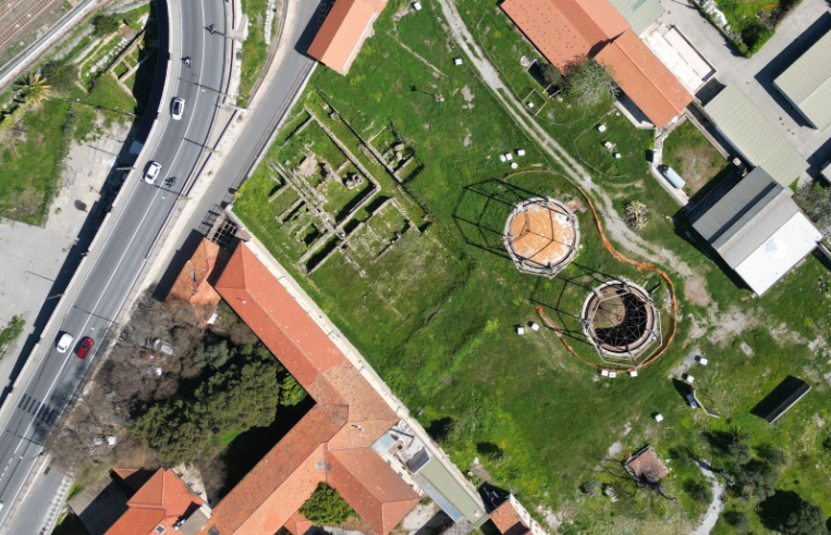
Non è facile cominciare a raccontare questa storia, quindi comincio da dove mi viene in mente. Avete presente un gasometro? Avete mai visto un gasometro dal vivo o in foto, in video, in televisione? Fino ad alcuni anni fa per me era una parola un po’ strana eppure è diventato uno dei luoghi con cui ho a che fare più spesso nella mia vita quotidiana. A Ventimiglia, dentro un’area archeologica romana abbastanza famosa e importante, ci sono due gasometri. Alcuni anni fa ho iniziato a occuparmi di questi due gasometri e di tutto quello che ci sta intorno che si chiama Officina del Gas è un impianto abbastanza grande, di 12.000 m² che dal 1906 al 1993 ha funzionato per dare il gas alla città.
Prima di iniziare a lavorare veramente alla realizzazione del progetto, con alcune persone molto preparate ho iniziato a studiare la storia di questo luogo e a farmi raccontare dalle persone che ci vivono accanto che cosa rappresenta per loro.
Ma un giorno ho anche condiviso alcune immagini di questi gasometri e di altri gasometri, tra cui quello di Corso Farini a Torino, ed è successo quello che succede sul fediverso, cioè qualcuno ha commentato lanciando un ponte verso un altro mondo diverso, il mondo musicale.

Sembra quasi scontato ma ci sono alcuni generi specifici di musica che sembrano avere un legame profondo con l’immagine e l’essenza stessa di un gasometro e di un’officina del gas. Uno di questi generi è quello che possiamo etichettare come rock industriale, industrial rock, un genere che è molto diffuso soprattutto nel Regno Unito e in Germania. Un altro genere completamente diverso che ha un legame profondo con un gasometro con un impianto industriale è sicuramente la musica elettronica techno e techno industrial. Allora per chiudere temporaneamente il cerchio vediamo alcuni album e gruppi di artisti che hanno realizzato di recente o anche meno di recente una serie di opere musicali legate al gasometro. Non c’è quasi nulla che sia frutto di una mia ricerca: sono tutti suggerimenti che ho avuto sia dal fediverso sia da alcuni colleghi e colleghe che hanno condiviso con me questo percorso ed è interessante vedere che in certi casi addirittura il gasometro compare sulla copertina di un disco.
Ovviamente questa abbuffata musicale molto variegata mi ha fatto pensare che il gasometro, ora che ha smesso di funzionare, rimane un buon posto dove esplorare questa connessione musicale e quindi ho cominciato a lavorare per rendere possibile un ritorno di suoni e musica sotto i gasometri stessi.
Questa la selezione sul lato rock
Sul versante techno, ho queste tracce:
E per finire l’incredibile performance di Jeff Mills, Jean-Phi Dary and Prabhu Edouard dentro il sito archeologico di Delos, Tomorrow comes the harvest. La metto qui perché chiude il cerchio in modo mirabile riportando all’unità l’archeologia classica, la musica elettronica e l’archeologia industriale da cui sono partito.
I'm squishing four weeks worth of recap into this one post.
First, the numbers.
40 hours, 32 minutes all training
99 miles running
15,600 ft D+ running (and treadmill)
I'm less concerned with miles than I used to be, but I'm still writing these numbers down for continuity's sake.
I'm running four days a week and riding or other cross-training 2-3 days. Two of my runs are easy, but not slow. One has some high intensity intervals or hill sprints. The other is a 2-3 hour run with 45-60 minutes of tempo pace in the middle. My top speed hasn't increased in the past four weeks, but my easy pace has improved a lot. With five more weeks of training ahead before I begin to taper off, I'm looking forward to getting even faster at zones 2 and 3.
I've been switching between potential race shoes on my faster and longer runs. While the Hoka Tecton X 3 are growing on me, and the Kjerag are fun, I'm 99% sure that I'll run Quad Rock 25 in La Sportiva Prodigio Pros. They're well suited to the course, fit me well, and feel stable, fast, and adequately cushioned.
My favorite run of March was a Friday afternoon outing in Lory State Park with my friend, Dana. He's not training for any event, but is naturally faster than me, so our runs are a great opportunity to go a little harder. On this occasion we did two warm up miles in the valley and then went rapidly up Quad Rock climb no. 3 and quickly down descent no. 3 to what will be the finish on race day. I recorded segment times that were only a few seconds off my personal bests, and wasn't wrecked afterwards.
Last Sunday I went out by myself and ran through the first and second Quad Rock climbs (and matching descents). My calves and hamstrings cramped after a long, hard push in the middle of the run, and I struggled for the last four miles. That's the first time this season, a good reminder to fuel better on my long runs.
30 minutes of mobility and core strength exercises every morning are keeping my body in good shape. I've no Achilles tendinitis. My hips and back are pain free. No foot trouble. Inflammation and swelling in my right knee is troubling, but I'm keeping it in check with ice and, sometimes, ibuprofen. I hear that some people benefit from tart cherry extract as a supplement, and I'm going to give that a try.
After a couple years of being injured, I'm grateful to be close to 100 percent. It feels good.

Sourcepole hat an der FOSSGIS 2026 in Göttingen verschiedene Themen mit Vorträgen abgedeckt:


La Asociación gvSIG pasa a formar parte de la Red Iberoamericana de Observación Territorial (RIDOT), una iniciativa que reúne a instituciones y profesionales comprometidos con el análisis, la gestión y la comprensión del territorio en el ámbito iberoamericano.
Esta incorporación refuerza el compromiso de la Asociación gvSIG con la colaboración internacional y con el impulso de infraestructuras de datos espaciales, estándares abiertos y tecnologías basadas en software libre como pilares para la toma de decisiones y la gestión territorial.
La Red constituye un espacio clave para abordar de forma conjunta retos como el cambio climático, la gestión del riesgo, la planificación territorial o la gobernanza, promoviendo el intercambio de conocimiento y la generación de sinergias entre sus miembros.
Desde la Asociación gvSIG se contribuirá activamente a este ecosistema, aportando experiencia en el desarrollo e implantación de soluciones geomáticas abiertas y en la construcción de modelos basados en interoperabilidad y soberanía tecnológica.
Open data is only as useful as it is discoverable. Finding datasets, whether it’s satellite imagery, scientific research, or cultural archives involves navigating dozens of siloed portals, each of them with different interfaces and APIs. Project Matadisco tries to solve this by using ATProto to create an open, decentralized network for data discovery. Anyone can publish metadata about their datasets. You can then pick the records that matter to you and build views for the specific needs of your community. By focusing on metadata rather than the data itself, the system works with any dataset format, keeps records lightweight, and remains agnostic about storage.
It’s early stage and experimental, but the potential is significant. To see it in action, visit the matadisco-viewer demo. It listens to the incoming stream of ATProto events and renders them. At the moment it’s satellite images only, but that will hopefully change soon.

Above is an example of what crossed my screen while developing (metadata, download at full resolution (253MiB)).
Metadata records can be very diverse. They might describe geodata, your favourite news site or your favourite podcasts. What they all have in common is that users usually rely on centralized platforms in order to find them. For geodata, this is often a government-run open data or geo portal. These platforms decide which data gets published.
You might generate a derived dataset or clean up an existing one. If you operate from outside of the original creators, you probably won’t even be able to get your data linked from there. So how will anyone find out about it? That’s a problem of metadata discovery.
The other side of the problem is that even when metadata is available, it can be hard to find. There are large metadata aggregation portals like the portal for European data, with almost 2 million records. How do you find what exactly you are looking for. What if there were specialized portals tailored to specific communities?
For even more details, see the companion blog post of the IPFS Foundation.
The idea is to support both: an easy way for anyone to publish discoverable metadata, and a way to make that metadata widely accessible to build both large aggregators and specialized portals tailored to specific communities.
The central building block is ATProto. It allows anyone to publish and subscribe to records. Rather than defining a single metadata schema to rule them all, the approach here is more meta-meta. Each record contains a link to the actual metadata. That’s the absolute minimum. Though it could make sense to go beyond this minimalism and store additional information to make it easier to build custom portals.
One example of such additional information is a preview. It’s nice to get a quick sense of the underlying data that the metadata describes. For satellite imagery, this could be a true color thumbnail of the scene. For long form articles, a summary or excerpt. For podcasts it may be a brief audio snippet or trailer.
As part of my work at the IPFS Foundation, I started with geodata. The first prototype focuses on [Copernicus Sentinel-2 L2A satellite images].
The metadata is sourced from Element 84’s Earth Search STAC catalogue. It provides free, publicly accessible HTTP links to the images (the official Copernicus STAC does not). A [Cloudflare Worker] checks the STAC instance every few minutes for updates. When new records appear, a link to the metadata along with a preview is ingested into ATProto. The source code for the worker is available at https://github.com/vmx/sentinel-to-atproto/.
Below is the Lexicon schema for this ATProto meta-metadata record, which I call Matadisco. To improve readability, the MLF syntax is used:
/// A Matadisco record
record matadisco {
    /// The time the original metadata/data was published
    publishedAt!: Datetime,
    /// A URI that links to resource containing the metadata
    resource!: Uri,
    /// Preview of the data
    preview: {
        /// The media type the preview has
        mimeType!: string,
        /// The URL to the preview
        url: Uri,
    },
}
Once records are available on ATProto, they can be processed and displayed. I built a simple viewer that renders records conforming to the cx.vmx.matadisco Lexicon schema defined above. A Bluesky Jetstream instance streams newly added records directly into the browser. A demo is available at https://vmx.github.io/matadisco-viewer/.
If you’re interested in seeing the raw records, you can find them on my ATProto dev account.
This work builds on ideas by Tom Nicholas, who started a project called FROST. His motivating blog post is an excellent read about data-sharing challenges in a scientific context. His presentation on FROST explains why such a system should remain simple, with the metadata URL as the only required field.
Edward Silverton, who works in the GLAM space, explored a similar idea for publishing IIIF data. We refined his approach to align it more closely with FROST. He published further details on the complete workflow for his use case, which has a broader scope.
There was also a discussion thread on Bluesky about metadata for long-form content to build cross-platform discovery.
Possible future steps I want to look into:
As mentioned in the introduction, this is deliberately experimental, things may break or change dramatically. The upside is that no one needs to worry about breakage. Please experiment with these ideas and let us now about them at the Matadisco GitHub repository. Publish records under your own namespace, or even reuse the one I am currently using.

Prezado leitor,
Se você trabalha com dados geoespaciais, principalmente rasters, provavelmente já esbarrou em problemas como:
É exatamente aqui que entra o STAC (SpatioTemporal Asset Catalog). Mais do que um formato, o STAC é um padrão moderno para organizar, catalogar e acessar dados geoespaciais, permitindo buscas rápidas e interoperáveis.
Neste guia, você vai aprender a montar um ambiente completo para:
Este post apresenta, passo a passo, como montar um ambiente completo para criação e publicação de um catálogo STAC (SpatioTemporal Asset Catalog), utilizando Docker, PostGIS, GeoServer e uma API intermediária (adapter). O objetivo é permitir que você organize, publique e consuma dados geoespaciais modernos de forma eficiente.
Antes de começar, é importante entender o papel de cada componente:
Um ponto importante: o GeoServer ainda não consome STAC “puro” de forma completa, por isso o uso do adapter é essencial.
Antes de instalar qualquer ferramenta, é importante garantir que o sistema esteja atualizado. Isso evita problemas de dependência e incompatibilidade.
> sudo apt update
> sudo apt upgrade -y
O Docker será usado para isolar cada componente da arquitetura, garantindo reprodutibilidade. Isso evita conflitos de versão e facilita deploy em outros ambientes.
2.1 Adicionar chave GPG:
> curl -fsSL https://download.docker.com/linux/ubuntu/gpg | \
> sudo gpg --dearmor -o /usr/share/keyrings/docker-archive-keyring.gpg
2.2 Adicionar repositório:
echo \
"deb [arch=$(dpkg --print-architecture) signed-by=/usr/share/keyrings/docker-archive-keyring.gpg] https://download.docker.com/linux/ubuntu \ $(lsb_release -cs) stable" | \ sudo tee /etc/apt/sources.list.d/docker.list > /dev/null
2.3 Instalar Docker + Compose:
> sudo apt update
> sudo apt install docker-ce docker-ce-cli containerd.io docker-compose-plugin -y
Com isso, você terá um ambiente isolado para rodar toda a stack sem conflitos de versão.
Agora vamos organizar os diretórios do projeto:
> sudo mkdir -p /docker/geoserver/plugins
> cd /docker/geoserver/plugins
O plugins que iremos realizar o download adicionam suporte a:
Sem esses plugins, o GeoServer não consegue trabalhar corretamente com dados cloud-native.
> wget https://build.geoserver.org/geoserver/2.27.x/community-latest/geoserver-2.27-SNAPSHOT-cog-http-plugin.zip
> wget https://build.geoserver.org/geoserver/2.27.x/community-latest/geoserver-2.27-SNAPSHOT-cog-s3-plugin.zip
> wget https://build.geoserver.org/geoserver/2.27.x/community-latest/geoserver-2.27-SNAPSHOT-stac-datastore-plugin.zip
Criamos um Dockerfile para incluir os plugins:
cd /docker/geoserver
nano Dockerfile
O conteúdo do arquivo:
FROM docker.osgeo.org/geoserver:2.27.2

COPY plugins/*.jar /usr/local/tomcat/webapps/geoserver/WEB-INF/lib/
Aqui estamos estendendo a imagem padrão do GeoServer para suportar STAC e COG.
Agora definimos toda a infraestrutura: Banco de dados (PostGIS), API STAC e GeoServer. Vamos então criar o arquivo docker-compose.yaml:
cd /docker
nano docker-compose.yaml
Esse arquivo é o coração da infraestrutura, ele define como os serviços se comunicam e persistem dados. O conteúdo do arquivo:
volumes:
  postgis-data:
  geoserver-data:

networks:
  internal:
  external:

services:

  db:
    container_name: postgis
    image: postgis/postgis:16-3.4
    volumes:
      - postgis-data:/var/lib/postgresql/data
    environment:
      - POSTGRES_DB=postgis
      - POSTGRES_USER=postgis
      - POSTGRES_PASSWORD=senha_postgis
      - IP_LIST=*
      - ALLOW_IP_RANGE=0.0.0.0/0
      - POSTGRES_MULTIPLE_EXTENSIONS=postgis,hstore,postgis_topology,postgis_raster,pgrouting,btree_gist
      - FORCE_SSL=false
    ports:
      - "5432:5432"
    restart: unless-stopped
    healthcheck:
      test: ["CMD-SHELL", "pg_isready -U postgis-d postgis"]
      interval: 5s
      timeout: 5s
      retries: 10
    networks:
      - internal

  geoserver:
    container_name: geoserver
    build: ./geoserver
    volumes:
      - geoserver-data:/opt/geoserver/data_dir
      - /docker/geoserver/imagem_raster:/opt/geoserver/data_dir/coverages
    environment:
      - TZ=America/Sao_Paulo
      - GEOSERVER_ADMIN_USER=admin
      - GEOSERVER_ADMIN_PASSWORD=geoserver
      - INSTALL_EXTENSIONS=true
      - EXTRA_JAVA_OPTS=-Xms4G -Xmx6G
      - STABLE_EXTENSIONS=importer,wps,pyramid
      - PROXY_BASE_URL=http://192.168.186.140:8083/geoserver
      - GEOSERVER_CSRF_WHITELIST=192.168.186.140
      - HTTP_SCHEME=http
      - CORS_ENABLED=false
    ports:
      - "8083:8080"
    restart: unless-stopped
    healthcheck:
      test: curl --fail "http://localhost:8080/geoserver/web/wicket/resource/org.geoserver.web.GeoServerBasePage/img/logo.png" || exit 1
      interval: 1m30s
      timeout: 10s
      retries: 3
    networks:
      - internal
      - external

  stac:
    container_name: stac-api
    image: ghcr.io/stac-utils/stac-fastapi-pgstac:latest
    environment:
      - PGHOST=db
      - PGPORT=5432
      - PGDATABASE=postgis
      - PGUSER=postgis
      - PGPASSWORD=senha_postgis
    ports:
      - "8085:8080"
    depends_on:
      db:
        condition: service_healthy
    networks:
      - internal
Agora é subir o ambiente:
> docker compose build
> docker compose up -d
Instalar a ferramenta:
sudo apt install -y pipx
pipx ensurepath
source ~/.bashrc
pipx install "pypgstac[psycopg]"
Configurar conexão:
export PGHOST=127.0.0.1
export PGPORT=5432
export PGDATABASE=postgis
export PGUSER=postgis
export PGPASSWORD=senha_postgis
Rodar migração:
> pypgstac migrate
Esse comando cria toda a estrutura STAC dentro do banco:
Sem isso, a API STAC não consegue funcionar.
Collections funcionam como agrupadores lógicos de dados. Exemplos: Sentinel-2, Ortofotos, Modelos de elevação.
Crie o arquivo:
nano collection.json
Conteúdo do arquivo:
{
  "id": "raster-test",
  "type": "Collection",
  "description": "Teste de raster",
  "license": "proprietary",
  "extent": {
    "spatial": { "bbox": [[-180, -90, 180, 90]] },
    "temporal": { "interval": [["2024-01-01T00:00:00Z", null]] }
  }
}
Para inserir no banco, execute o comando abaixo:
pypgstac load collections collection.json
Os Items representam os dados reais. Exemplo: Um raster específico, um ortomosaico, uma cena de satélite.
Crie o arquivo:
nano item.json
Conteúdo do arquivo:
{
  "type": "Feature",
  "stac_version": "1.0.0",
  "id": "paraiso-ortomosaico",
  "collection": "raster-test",
  "geometry": {
    "type": "Polygon",
    "coordinates": [[
      [-48.8961561, -25.0593974],
      [-48.8764276, -25.0593974],
      [-48.8764276, -25.0730781],
      [-48.8961561, -25.0730781],
      [-48.8961561, -25.0593974]
    ]]
  },
  "bbox": [-48.8961561,-25.0730781,-48.8764276,-25.0593974],
  "properties": {
    "datetime": "2024-01-01T00:00:00Z",
    "proj:epsg": 4326
  },
  "assets": {
    "data": {
      "href": "http://SEU_IP:9000/rasters/seu_arquivo.tif",
      "type": "image/tiff",
      "roles": ["data"]
    }
  }
}
Inserir item no banco:
pypgstac load items item.json
Se você precisar editar o conteúdo do json e realizar um update no banco, use o seguinte comando:
pypgstac load items item.json --method upsert
Você ainda tem uma outra opção que é a criação automático do arquivo json através do rio-stac, para isso você precisa:
pipx install rio-stac --include-deps
rio stac orotomosaico_cog.tif > item.json
Dica importante:
O campo “href”: “http://SEU_IP:9000/rasters/seu_arquivo.tif” do JSON, é o link para o dado real (idealmente um COG acessível via HTTP ou S3).
Essa é uma das partes mais importantes da arquitetura, pois o GeoServer não consume STAC de forma totalmente nativa. Então esse adapter vai resolver as incompatibilidades do GeoServer com STAC, ajustando links e headers.
Para o STAC funcionar perfeitamente no GeoServer, é necessário realizar alguns ajustes de:
Devido a esse problema, foi desenvolvido um adapter em FastAPI que: intercepta requisições, ajusta os links (href), corrige headers e diferencia chamadas internas e externas.
Criar API:
mkdir /docker/api
cd /docker/api
nano adapter.py
Conteúdo do arquivo adapter.py
from fastapi import FastAPI, Request
from fastapi.responses import JSONResponse
import requests
import os

app = FastAPI()

STAC_URL = "http://stac-api:8080"

# URLs
PUBLIC_URL = os.getenv("PUBLIC_URL", "http://192.168.186.140:8087")
INTERNAL_URL = "http://stac-adapter:8081"


# -------------------------
# Helper para requisições
# -------------------------
def fetch(url, method="GET", json=None):
    if method == "POST":
        r = requests.post(url, json=json)
    else:
        r = requests.get(url)

    r.raise_for_status()
    return r.json()


# -------------------------
# Detecta se é chamada interna (GeoServer)
# -------------------------
def is_internal(request: Request):
    host = request.headers.get("host", "")
    return "stac-adapter" in host or "geoserver" in host


# -------------------------
# Fix links (inteligente)
# -------------------------
def fix_links(data, internal=False):
    base = INTERNAL_URL if internal else PUBLIC_URL

    def fix(obj):
        if isinstance(obj, dict):
            for k, v in obj.items():
                if k == "href" and isinstance(v, str):
                    obj[k] = v.replace("http://stac-api:8080", base)
                else:
                    fix(v)
        elif isinstance(obj, list):
            for item in obj:
                fix(item)

    fix(data)
    return data


# -------------------------
# ROOT
# -------------------------
@app.api_route("/", methods=["GET", "HEAD"])
async def root(request: Request):
    data = fetch(f"{STAC_URL}/")
    return JSONResponse(
        content=fix_links(data, internal=is_internal(request)),
        media_type="application/json"
    )


# -------------------------
# COLLECTIONS
# -------------------------
@app.api_route("/collections", methods=["GET", "HEAD"])
async def collections(request: Request):
    data = fetch(f"{STAC_URL}/collections")
    return JSONResponse(
        content=fix_links(data, internal=is_internal(request)),
        media_type="application/json"
    )


# -------------------------
# COLLECTION
# -------------------------
@app.api_route("/collections/{collection_id}", methods=["GET", "HEAD"])
async def collection(collection_id: str, request: Request):
    data = fetch(f"{STAC_URL}/collections/{collection_id}")
    return JSONResponse(
        content=fix_links(data, internal=is_internal(request)),
        media_type="application/geo+json"
    )


# -------------------------
# ITEMS
# -------------------------
@app.api_route("/collections/{collection_id}/items", methods=["GET", "HEAD"])
async def items(collection_id: str, request: Request):
    data = fetch(f"{STAC_URL}/collections/{collection_id}/items")
    return JSONResponse(
        content=fix_links(data, internal=is_internal(request)),
        media_type="application/geo+json"
    )


# -------------------------
# ITEM ESPECÍFICO
# -------------------------
@app.api_route("/collections/{collection_id}/items/{item_id}", methods=["GET", "HEAD"])
async def item(collection_id: str, item_id: str, request: Request):
    data = fetch(f"{STAC_URL}/collections/{collection_id}/items/{item_id}")
    return JSONResponse(
        content=fix_links(data, internal=is_internal(request)),
        media_type="application/geo+json"
    )


# -------------------------
# SEARCH
# -------------------------
@app.api_route("/search", methods=["GET", "POST", "HEAD"])
async def search(request: Request):
    if request.method == "POST":
        body = await request.json()
        data = fetch(f"{STAC_URL}/search", method="POST", json=body)
    else:
        data = fetch(f"{STAC_URL}/search")

    return JSONResponse(
        content=fix_links(data, internal=is_internal(request)),
        media_type="application/geo+json"
    )
Agora vamos ao conteúdo do arquivo Dockerfile:
FROM python:3.11-slim

WORKDIR /app

RUN pip install fastapi uvicorn requests

COPY adapter.py .

CMD ["uvicorn", "adapter:app", "--host", "0.0.0.0", "--port", "8081"]
E pra finalizar, você deve adicionar ao seu docker-compose:
adapter:
  container_name: stac-adapter
  build: ./api
  ports:
    - "8087:8081"
  depends_on:
    - stac
  networks:
    - internal
    - external
Agora é só subir o adapter:
docker compose up -d --build
Agora, para finalizar, vamos instalar o nginx e deixar tudo rodando externamente na porta 80. O Nginx atua como proxy reverso, centralizando o acesso:
E ainda ajuda na organização das rotas, facilidade de exposição externa e melhor controle de segurança.
Vamos criar o arquivo nginx-stac.conf:
cd /docker/
nano nginx-stac.conf
Esse arquivo deve conter o seguinte conteúdo:
server {
    listen 80;

    # -------------------------
    # GEOSERVER
    # -------------------------
    location /geoserver/ {
        proxy_pass http://geoserver:8080/geoserver/;

        proxy_set_header Host $host;
        proxy_set_header X-Real-IP $remote_addr;
        proxy_set_header X-Forwarded-For $proxy_add_x_forwarded_for;
    }

    # -------------------------
    # STAC (via adapter)
    # -------------------------
    location /stac/ {
        proxy_pass http://adapter:8081/;

        proxy_set_header Host $host;
        proxy_set_header X-Real-IP $remote_addr;
        proxy_set_header X-Forwarded-For $proxy_add_x_forwarded_for;
    }

    # -------------------------
    # STAC DIRETO (opcional)
    # -------------------------
    location /stac-api/ {
        proxy_pass http://stac-api:8080/;

        proxy_set_header Host $host;
        proxy_set_header X-Real-IP $remote_addr;
    }
}
Você precisar alterar a seguinte linha do arquivo adapter.py:
PUBLIC_URL = os.getenv("PUBLIC_URL", "http://192.168.186.140:8087")
Para:
PUBLIC_URL = os.getenv("PUBLIC_URL", "http://192.168.186.140/stac")
Agora é só subir o seu container, e pronto:
docker compose up -d --build
Se tudo estiver correto, você verá sua collection retornada via API.
Com essa arquitetura, você passa a ter:
Mais do que isso, você construiu uma base sólida para aplicações geoespaciais modernas, preparada para lidar com grandes volumes de dados de forma eficiente.
Spoiler Alert: This is a pretty geeky post that may only appeal to Dead Heads!
I had an idea to go back to my Dead Reckoning project to look at the frequency that different songs were played by the Grateful Dead over the 31 years of gigging. I had already extracted the set lists for nearly all of the 2,313 shows the band played between 1965 and 1995 from JerryBase so I thought this would be relatively simple (it never is).
I asked Claude to parse the 31 years of gig files and make a table ranking the top 100 songs played over this period and showing the number of times played in each year and what percentage of gigs it was played as an indicator of the band’s favourites over time. This was nice and easy and after one small tweak I had a nice table.

Then I asked Claude to make me a heatmap graphic from the table with the colour intensity representing the frequency that a song was played. Hey presto, Claude used mapplotlib and numpy to generate the heatmap and it looked pretty good. The problem was that a 100 row 32 column graphic is pretty hard to read, over quite a few iterations I improved the colour palette to get better definition between the ranges, sorted out the legend which was more difficult than I expected and fought with Claude and the libraries to get a legend and year labels at the top and bottom of the graphic. You can see the result here – even though this is a 1.4Mb image it still isn’t easy to read.

Then I asked Claude if it could turn the graphic into an interactive web page and in a minute it came back with this interactive heatmap of song frequency by year which I think is pretty cool and provides a much better way of exploring the data and spotting the trends.

In a couple of hours I had gone from 31 files listing over 2,300 gigs to an interactive frequency graphic with a lot of help from Claude – without that help I would not have known where to start.

Ben je nieuwsgierig naar geo, maar weet je niet waar te beginnen? Of wil je overstappen naar open source software? Dan is de OSGeoNL Startersdag dé kans om een dag lang laagdrempelig kennis te maken met het open source geo-landschap.
Kom ontdekken wat open source geo-software voor jou kan betekenen, maak nieuwe connecties en laat je inspireren!

QField’s first release of the year comes packed with new features as well as a bundle of improvements and polishing. Let’s jump right into it.
This new version of QField comes with a shiny 3D map view, giving users the ability to render their map content on top of a three-dimensional terrain.
Users can rotate the terrain geometry to get a better understanding of elevation profiles, while also adjusting the plane’s extent by panning and zooming with drag and pinch gestures. When the GNSS positioning service is enabled, the user’s current position, as well as ongoing tracking sessions, will be overlaid on top of the 3D terrain geometry.
By default, QField relies on Mapzen Global Terrain tiles to determine terrain elevation. As its name indicates, this is a 30-meter digital elevation model covering the globe and hosted online, which allows QField to render 3D views without any user configuration. But it does not stop there. QField supports additional elevation sources, such as disk-based GeoTIFFs, to work in offline areas. This can be configured when setting up a project by changing the terrain type in QGIS.
Moving on to the next major functionality introduced in this new version: a COGO (Coordinate Geometry) framework to support fieldwork through a set of parameter-driven operations to generate vertices. This has been one of the most requested features by professional land surveyors, so we couldn’t be more excited to deliver it and hear back from our community.
QField 4.1 ships with three COGO tools:
Leveraging QField’s capabilities, a COGO operation’s point parameter can be defined in multiple ways: users can enter values manually or automatically fill in the parameter using either the current GNSS position, the geometry of a pre-existing feature within a point layer, or the coordinate cursor’s location. The latter is super useful when coupled with project snapping.
Beyond these two flagship features, this new version contains tons of improvements.
We’re happy to report that the background tracking functionality introduced for Android last year is now available on iOS. Users can now save battery by locking their phone while QField continues to track positions. Upon reopening QField, the collected positions will be written into your project. No Apple will be left behind.
The feature form continued to receive improvements during this development cycle. Starting with this version, Remember Last Value pins are hidden by default. Moving away from an always-shown interface, remember last value pin visibility can now be configured per field. Using the latest QGIS (4.0 and above), users can configure the presence of the pin and whether remembrance should be active by default in the vector layer properties’ attribute form panel.
Position tracking has received a lot of attention during this development cycle focused on optimizations. Tracking is now friendlier to your device battery while user interface responsiveness has been improved when tracking sessions are ongoing. We’ve also spent some time making Bluetooth connections to external GNSS devices even more reliable. If this was an issue for you in the past, give this version a try again.
Finally, something to please our advanced users: QField now offers the ability to tunnel network traffic through a proxy that can be enabled and configured in the settings panel.
The Barents Sea, a marginal sea of the Arctic Ocean bordered by Norway and Russia, is one of the most ecologically and geopolitically significant water bodies on the planet. Home to some of the world’s largest cod and haddock fisheries, it sustains both marine ecosystems and the livelihoods of coastal communities across the high north. Its waters are a barometer for our changing climate: the Barents Sea is the fastest-warming part of the Arctic, making it a critical area of scientific observation and environmental monitoring. The Nansen Legacy project has been tracking these changes closely (factsheet).
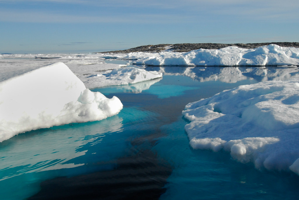 Sea ice in the Barents Sea, Peter Prokosch https://www.grida.no/resources/3636
At OPENGIS.ch, we see the Barents Sea as a powerful symbol of why field data collection matters. Understanding and protecting remote, extreme environments like the Arctic requires tools that are reliable, offline-capable, and built for real-world conditions. That is precisely what QField is designed to deliver.
With QField 4.1 ‘Barents Sea’, we continue building on that mission, bringing new capabilities to field workers, researchers, and environmental stewards wherever their work takes them.
Happy field mapping!

by Andrea Aime (noreply@blogger.com) at March 20, 2026 03:49 PM

GeoServer 2.28.3 release is now available with downloads (bin, war, windows), along with docs and extensions.
This is a maintenance release of GeoServer providing existing installations with minor updates and bug fixes. GeoServer 2.28.3 is made in conjunction with GeoTools 34.3, and GeoWebCache 1.28.3.
Thanks to Andrea Aime (GeoSolutions) for making this release.
Improvement:
Bug:
Task:
For the complete list see 2.28.3 release notes.
Community module development:
Community modules are shared as source code to encourage collaboration. If a topic being explored is of interest to you, please contact the module developer to offer assistance.
Additional information on GeoServer 2.28 series:
Release notes: ( 2.28.3 | 2.28.2 | 2.28.1 | 2.28.0 | 2.28-M0 )

I was looking for a simpler project to build after my last couple which had proved more complicated than I had anticipated. I came up with the idea of mapping airports and finding some data on their environmental impact – good idea, but not so easy.
Finding a dataset of airports was relatively easy, the OurAirports dataset has excellent coverage but sourcing open data about passenger numbers or emissions associated with specific airports was challenging to say the least. Eventually I settled for US, UK and EU airports where there was good passenger data from the US FAA, EU Eurostat and UK CAA. Maybe I will come back to this project in the future and try to build out to cover more regions.
Inevitably the data from each source was in different formats, had different coverage and took a lot of wrangling to get into a consistent data model. Claude was my best friend, writing python scripts for processing the data and combining it into a single coverage.
I could not find any consistent emissions data for the 600 airports that I was working with so I used an estimate of 125kg per passenger which is very broad brush (a more accurate calculation would distinguish between short haul and long haul flights, use passenger miles etc but I didn’t have the data).
I had an idea to try and calculate the impact of flights based on the population near an airport. Claude suggested using the WorldPop Global Population raster data for 2024 – and wrote a python script to calculate the population within a 20km radius of the airport using Geopandas, Rasterio and Shapely (I hope you are impressed that I have a clue as to what these libraries do).
The map build was relatively straightforward once I had the data. The default visualisation shows estimated emissions based on passenger numbers on a colour scale green to red and is sized by the population impacted within a 20km zone. The alternative is to show passenger numbers by symbol size. For both visualisations the year slider allows you to select a year and the info pop-up shows that year’s stats. The summary stats update as you zoom in to show the number of airports in the current view and the emissions or passenger numbers.
Although this is best viewed on a laptop or tablet screen, I managed to tweak it to work reasonably on a mobile (view in landscape is better than portrait).
All in all this isn’t perfect and I am not sure how enlightening it is but there are a couple of interesting observations about impact. Some smaller airports can have a bigger impact because they are located close to large populations eg London City Airport is a small airport with about 3.5m passengers n 2024 and estimated CO2 of under 0.5m tonnes but because of it’s location it has a moderate impact on 3.7m people while Heathrow with 84m passengers and 10.5m tonnes of CO2 is more rural and only impacts 1.6m people. Similarly La Guardia has half the emissions and passengers of JFK but impacts double the number of people because of its location.

If you know of an open source of passenger or flight data for other regions or some emissions data, send me a message in the comments and I will try to update the map.

Hace ya algunos años nació gvSIG Batoví, una iniciativa orientada a acercar los Sistemas de Información Geográfica (SIG) al ámbito educativo en Uruguay, especialmente en educación primaria y secundaria.
Su objetivo sigue siendo plenamente vigente: facilitar a docentes y alumnado la comprensión del territorio a través de herramientas geoespaciales abiertas.
gvSIG Batoví es una distribución de gvSIG Desktop adaptada al entorno educativo, pensada para que el uso de los SIG en el aula sea accesible, práctico y motivador.
Su enfoque va mucho más allá de la enseñanza de la geografía. Puede aplicarse a cualquier materia con componente territorial, como historia, ciencias naturales, economía o sociología… o una combinación de todas ellas que permita a los estudiantes conocer su entorno.
A través de mapas temáticos y análisis espacial, el alumnado puede interactuar con la información, comprender mejor los fenómenos y desarrollar pensamiento crítico sobre el territorio.
Además:
Desde sus inicios gvSIG Batoví ha estado especialmente vinculado a iniciativas educativas en Uruguay, como el conocido curso-concurso que ha permitido a muchos estudiantes iniciarse en el mundo de la geomática.
Queremos que este recurso siga siendo útil para la comunidad educativa, por lo que puedes descargarlo y empezar a utilizarlo desde aquí:

QGIS 4.0 is out. After years of work by hundreds of volunteers and organisations around the world (migrating to Qt6, reworking the codebase, shipping over 100 new features on top) we have a platform that will serve the community for the next decade. That’s worth celebrating.
It’s also a good moment to be honest about what it takes to keep a project like this healthy, and to ask for your help.
QGIS is built by a broad ecosystem of contributors: individual volunteers, companies contributing developer hours, and everything in between. That mix of people and organisations who care about open-source geospatial software is what makes QGIS what it is, and it’s something we’re proud of.
What sustaining memberships fund is the layer of support that makes all that volunteer and contributed work more effective: reliable infrastructure, funded bug fixing rounds, documentation writers, and a small number of specialist tasks that are hard to get done consistently on volunteer time alone.
Our annual membership income has grown to €320,000, but our 2026 budget requires €634,000 in expenses. To cover that sustainably we need to grow sustaining memberships by at least €100,000 per year. If your organisation uses QGIS, now is the time to join.
This is what your support makes possible.
The PSC runs on contributed time. Over the years the administrative workload around membership, correspondence, procurement, and coordination has grown to the point where it regularly crowds out the work that actually needs experienced people. A part-time funded secretary (€30,000, a first in the project’s history) means PSC volunteers can focus on what only they can do.
The volume of contributions to QGIS has outgrown what volunteers can review promptly. We’ve grown the PR review budget from €30,000 to €40,000, but demand still outpaces funding. Faster reviews mean better code quality and a healthier contributor community. We would like to increase this budget even more.
Security expectations for software used in government, enterprise, and critical infrastructure are rising fast. The EU Cyber Resilience Act and similar regulations are making this concrete for open source projects. QGIS needs to meet that bar: documented processes, vulnerability handling, compliance support, and ongoing code hardening.
We’ve doubled our security budget to €10,000 this year. Security work touches packaging, infrastructure, the plugin ecosystem, and how we respond to disclosures. Growing this budget is a priority and directly benefits every organisation that needs to justify QGIS to an IT or procurement team.
Each bug fixing round now costs €55,000, up from €40,000 in the 3.x era. Three rounds per year, €165,000 total. This is what keeps every release stable for the half million daily users who depend on it.
The grants programme funds community-driven improvements voted on by the community. It’s been flat at €40,000 for years despite the project growing. Growing it is a direct priority for this campaign.
We’re looking for:
Memberships run for one year and can be renewed automatically. To get started, write to our treasurer at finance@qgis.org or visit the membership page.
QGIS.org is a Swiss non-profit with external auditing, published financial reports, and transparent governance. A sustaining membership is an investment in critical geospatial infrastructure that your organisation already relies on.
Financial reports · Annual reports · Membership details
Illustration by Muhammad Afandi on Unsplash

QGIS 4.0 is now available! But yes, you have read my title correctly - I would recommend many people don’t upgrade…. yet.
QGIS 4.0 is an ‘Early Adopter’ version - which means that there are new things in there that may break. I would also say for many basic users (and some intermediate users) there isn’t much new that’s changed, so you are not missing out on much (see below for some new things coming up).
Many of the changes for 4.0 are under the hood, so that’s why you won’t see many differences. These changes are important - and will make the software more reliable and easier to maintain.
Rather than upgrading now, I would recommend waiting until 4.2 is released (about July 2026) and by this point QGIS will be more stable, and it will be fine to upgrade then.
If you are really keen, and if you have used the OSGeo4W installer on Windows, then you have the ability to install two versions of QGIS at once. This is the approach I use, to keep both the latest LTR (long term release) and the latest version available on my desktop. I currently have QGIS 4.0 and QGIS 3.44.8 on my computer. To get this, run the installer and choose from the options below. Cycle through the versions by clicking on the version number until you get 4.0.0-1. or similar under “qgis: QGIS Desktop”.

If you have already installed QGIS with the normal installer, and want to switch to the OSGeo4W installer, then you will need to uninstall QGIS first, and then install the OSGeo4W installer. See the guide for more information.
DO NOT do this if you have a big deadline coming up. It may break your installation of QGIS!
There is a great blog post on the ins and outs of QGIS version 4.0.
I would say the most important change is moving from Qt5 to Qt6. What is Qt you ask? Qt is the software that is used to make software - in this case QGIS. It provides a framework for the buttons, windows and interfaces that you see. It also allows the software to be cross-platform - so QGIS will run on Windows, macOS or Unix - with minimal changes.
Qt is widely used and helps create programmes as diverse as Adobe Photoshop Elements, Audacity, FreeCAD, Google Earth, OBS, Teamviewer, Telegram and VLC media player according to Wikipedia. Qt5 is being retired and Qt6 will now be supported until 2029.
Hopefully this will allow a few underlying bugs in QGIS to be fixed, including some related to macOS, but unfortunately apparently the bug of saving layers inside a geopackage on a Mac has not changed, yet.
You can check out the Visual Changelog to see all the new features, but one caught my eye - you can now double click an entry in the attribute table, and QGIS will zoom to it:

Thanks to Nass for implementing this.
It is also worth mentioning that if you use plugins in QGIS, these will need to be updated to work with QGIS 4.0. Many plugin authors have updated their plugins to work with QGIS 4.0, and out of the top 10 plugins, 7 are fully compatible, and 1 - qgis2web - is compatible but has out of date metadata:
Top 10 QGIS plugins (as of 18/02/2026):
| Plugin | Compatible |
|---|---|
| QuickMapServices | ✓ |
| OpenLayers Plugin | ✘ QGIS 4.0 not supported, and the plugin is now deprecated, I would suggest you use XYZ Maps in QGIS the browser panel instead |
| QuickOSM | ✓ |
| Semi-Automatic Classification Plugin | ✓ |
| HCMGIS | ✓ |
| mmqgis | ✓ |
| Lat Lon Tools | ✘ |
| Profile tool | ✓ |
| qgis2web | ✘ compatible, but metadata to be updated |
| Qgis2threejs | ✓ |
Plugins are updated all the time - this is the list at the time of writing, 18/03/2026. If you have a plugin that doesn’t work yet - do keep checking back. If you spot anything wrong with my list, let me know.
So, I said wait for QGIS 4.2 earlier, so when will it be out? The plan is for 4.2 to be released in July 2026, so not too long to wait. Check out the roadmap for more info.
Thanks for reading, and if you need advice with QGIS, I offer group training, one to one training and consultancy, please contact me for more details!
Happy GIS-ing!
You must be logged into the site to view this content.
It is with great pleasure that we would like to welcome COSS as our latest flagship sustaining member!
The COSS National QGIS collaboration launched in Finland to safeguard the sustainability of critical geospatial technology.
COSS aims to ensure the sustainability of the open source QGIS geospatial software that is essential to many public organizations’ operations, maintaining up-to-date security updates, and realizing productivity benefits from coordinated development. The collaboration is based on coordination among public authorities and on supporting the international QGIS community.
In the first phase, the following organizations have joined the national QGIS collaboration: the National Land Survey of Finland, the Finnish Forest Centre, the Finnish Transport Infrastructure Agency, the Finnish Environment Institute (Syke), and the Natural Resources Institute Finland (Luke). QGIS is a key part of daily geospatial work for many public authorities.
The main objectives of the national QGIS collaboration are:
The purpose of the national QGIS collaboration forum is to enable deeper joint discussion on QGIS development needs and to ensure that this essential technology remains vibrant and secure over the long term.
Going forward, Finnish organizations can participate in QGIS’s international activities and funding jointly and in a coordinated manner through the Finnish Centre for Open Systems and Solutions – COSS, which is a non-profit association that promotes the use of open source and open technologies in both the private and public sectors.
COSS centrally manages the administration related to the membership, communications, and liaison with the international QGIS community, so individual national organizations do not need to build separate connections of their own.
For more information:
Timo Väliharju
Executive Director, COSS ry
timo.valiharju@coss.fi
+358 50 330 3339
www.coss.fi
Dear QGIS Community,
We are very pleased to announce that this year’s round of grants is now available. The call is open to anybody who wants to make a contribution to QGIS funded by our grant fund, subject to the call conditions outlined in the application form.
This year’s budget is €40k and the deadline for the proposals is in four weeks, on Monday, 13 April 2026. Here’s the full timeline:
Please note the following guidelines:
The PSC of QGIS.ORG will examine the proposals, and has a veto power in case a proposal does not follow guidelines or is not in line with project priorities.
For more details, please read the introduction provided in the application form.
We look forward to seeing all your great ideas for improving QGIS!
With the QGIS Grant Programme 2025, we were able to support 6 enhancement proposals that improve the QGIS project. The following reports summarize the work performed:
Thank you to everyone who participated and made this round of grants a great success and thank you to all our sustaining members and donors who make this initiative possible!


